The Most Comprehensive California Housing Market Analysis: Looking at 11.5 Million Households and 32 Counties. Investing in California Housing is a Complicated Calculus.
- 1 Comment
The California housing market has had its worst year on record. 2008 will go down as one of the most difficult and volatile economic years in history. With that said, there is still a lingering notion or profound desire for bargain hunting. Many articles now try to call a bottom in the stock markets by looking at market fundamentals. Similarly many are now trying to call a bottom in housing in particular the California housing market.
It is hard not to be tempted to call a bottom. It is tempting to call a bottom since the median price of a California home has gone from a peak in May of 2007 of $484,000 to the current price of $258,000. That is a stunning drop of 46 percent in slightly over a year.
This is going to be a comprehensive housing report for the state of California. The challenging thing in today’s market isn’t so much that the data isn’t available, but trying to put the data together into some meaningful analysis. The data used in this report comes from the American Community Survey which was released only a few weeks ago and has data reflecting changes all the way up until the end of 2007. I’ve also combined this data with the home price data from DataQuick which has covered the California housing market for many years and is used by many analyst and reporters.
The data in this analysis will cover 32 of the most populace counties in the state and covers 33,888,596 people and 11,561,712 households. This should be a very comprehensive report. The main question many people are thinking about is whether the state of California is or near a housing bottom. Simply stating we have a bottom because prices have fallen 46 percent from their peak is not an economic argument or holds much water under analysis. We had a prolonged bubble that had its roots planted way back in 1979. It took many years to build and hit the peak only last year. We may be looking at a multiple year correction here.
Analysis #1 – Income to Price Ratios
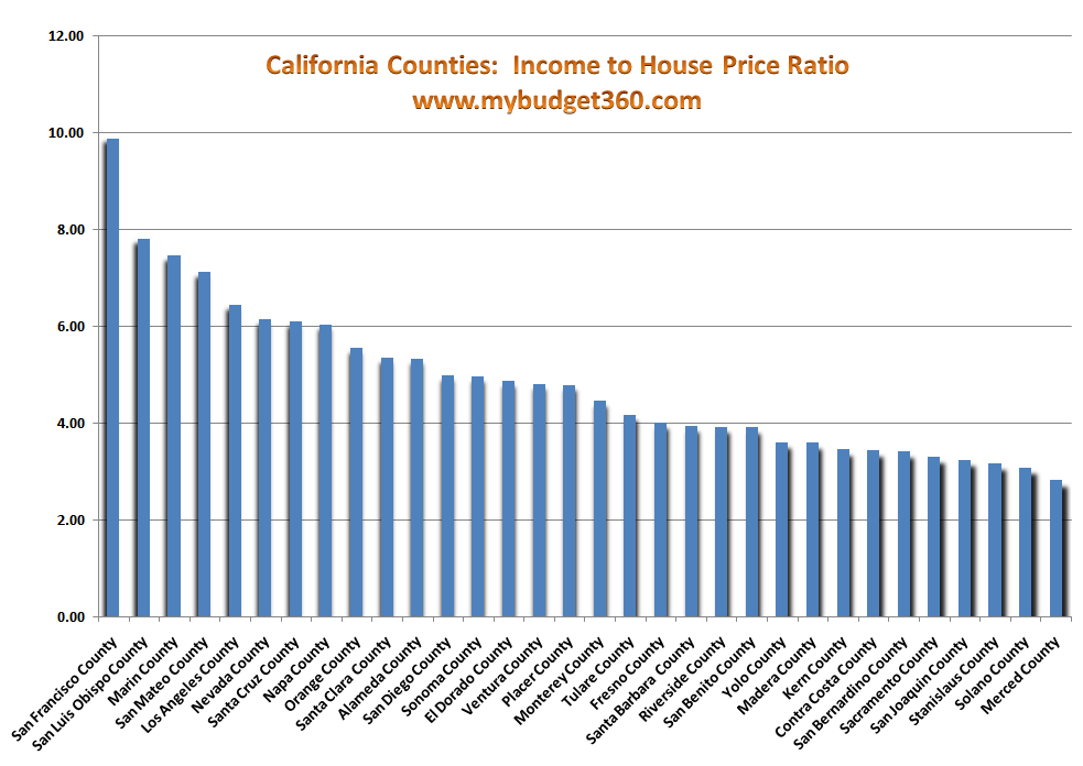
*Click for sharper image
One excellent measure of determining whether a home is affordable is looking at the income of households living in the immediate area. This is a very important data point. For example, a median price of $1 million may seem a lot on the surface but if the median household income of the area is $300,000 per year, then the price is right. In this same line of thought, a home priced at $50,000 is expensive if the median income of an area is $5,000.
The above chart tells us a lot. First, we see that the three most expensive counties are:
San Francisco:Â Â Â Â Â Â Â Â Â Â Â Â Â Â Â Â Â Â Â Â 9.89
San Luis Obispo:Â Â Â Â Â Â Â Â Â Â Â Â Â Â Â Â Â 7.82
Marin County:Â Â Â Â Â Â Â Â Â Â Â Â Â Â Â Â Â Â Â Â Â 7.46
What the above information tells us for example is that the current median home price for San Francisco is 9.89 the median household income of the area. That is still extremely overpriced. In fact, 12 of the 32 counties on the list have income to price ratio of 5 or higher. This is high. Across the nation we will find income to price ratios of 3 or 4 which are more within historical standards.
The three least expensive counties in California are:
Stanislaus County:Â Â Â Â Â Â Â Â Â Â Â Â Â Â Â 3.18
Solano County:Â Â Â Â Â Â Â Â Â Â Â Â Â Â Â Â Â Â Â Â Â 3.09
Merced County:Â Â Â Â Â Â Â Â Â Â Â Â Â Â Â Â Â Â 2.83
What this tells us is that using a blanket statement like “California has hit a housing bottom” is missing the point. Certain counties may have already hit a bottom. Yet you will also need to look at the employment situation in some of these areas. I have provide 10 reasons why this recession will feel like a minor depression so now we have to also factor in whether other factors like employment growth will hold up. Looking at places like Detroit we find low ratios but the employment base is quickly shrinking.
And population size of a county does not indicate affordability. The largest populated county Los Angeles with 9.6 million people has a price to income ratio of 6.46. That is extremely high. Yet a county like San Bernardino with 1.9 million people now has a price to income ratio of 3.42. The dynamics of the California housing market are wide and varied.
Analysis #2 – Median Household Income
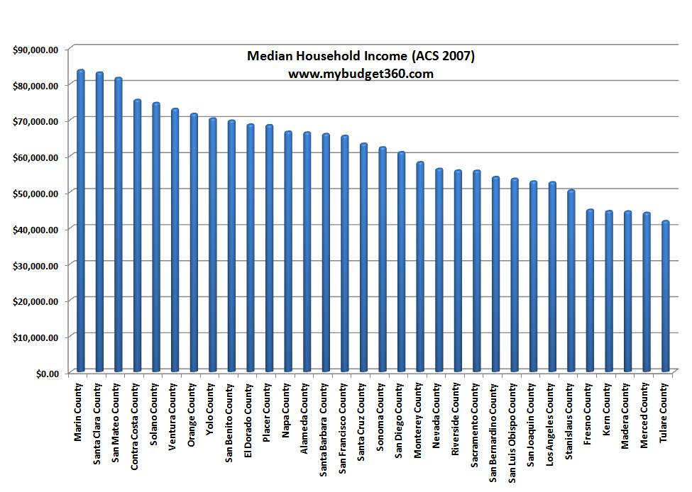
To say that a high median household income is enough to qualify for high home prices is wrong. I think this chart tells a lot more of the California housing bubble story. When prices reached nearly a $500,000 median price across the state, it was clearly a bubble because statewide the median household income is approximately $50,000. That at the peak put the ratio at 10 which is a difficult ratio to justify.
Even now after the historic bust, we are still very much overpriced. Let us look really quickly at the top 3 median household income areas and see what their price to income ratios are:
Marin County:Â Â Â Â Â Â Â Â Â Â Â Â Median Income:Â $83,732Â – Price-to-income ratio:Â 7.46
Santa Clara County:Â Â Â Median Income:Â $83,074Â – Price-to-income ratio:Â 5.37
San Mateo County:Â Â Â Â Median Income:Â $81,573Â – Price-to-income ratio:Â 7.12
This is very useful data. What we learn is median income in these 3 counties is very similar. Yet Santa Clara county has a better price ratio of homes to the current income of those in the area. Let us look at the bottom 3 income areas:
Madera County:Â Â Â Â Â Â Â Â Â Median Income:Â $44,534 – Price-to-income ratio:Â 3.6
Merced County:Â Â Â Â Â Â Â Â Â Median Income:Â $44,141 – Price-to-income ratio:Â 2.83
Tulare County:Â Â Â Â Â Â Â Â Â Â Â Median Income:Â $41,837 – Price-to-income ratio:Â 4.18
More useful information. The incomes again are rather similar for the bottom 3 yet if we look at the ratios, Merced County would be the most “affordable” place to buy.
Analysis #3 – Median Home Price
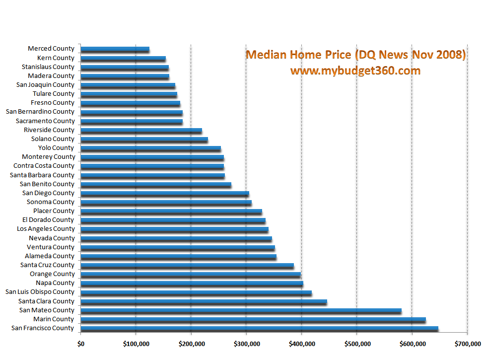
Just looking at the median home price does not tell the entire story. If you look at the above chart, we have 2 counties with prices over $600,000, 3 with over $500,000, and 5 with median prices over $400,000. We would have to go to $300,000 to find 16 counties with higher prices, or half of the 32 counties on the list.
But what is the population of these 16 counties?
Top 16 median priced counties:Â Â Â Â Â Â Â Â Â 22,701,908
Bottom 16 median priced counties:Â Â Â 11,186,688
Keep in mind that we are looking at the largest 32 counties in the state so we are not capturing 100 percent of the picture simply because all the data isn’t available but this data captures 90 percent of the California population. So on the surface, this may lead you to believe that most people can afford to live in high priced areas. Or is it that most of these high priced areas are in a bubble and that is why people are now struggling with holding onto their homes? Let us run a quick average of the price-to-income ratio of both subsets:
Top 16 counties average price to income ratio:Â Â Â Â Â Â Â Â Â Â 6.11
Bottom 16 counties average price to income ratio:Â Â Â Â 3.61
This is a very important data set here because of the bifurcation of the state. What we can derive is the lower priced counties are starting to find a bottom yet the top 16 are still over priced. This is important because someone looking to buy in Merced would arrive at a different conclusion than someone looking to buy in San Francisco. We are looking at income relative to each county so we are painting with a very narrow brush here.
Take a look at the population breakdown:
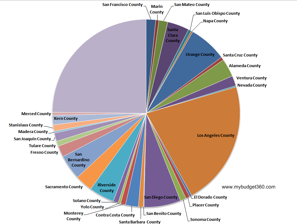
The above chart breaks down the 32 counties in our data set by population.
It is the case that the California housing market is diverse and has enormous variability. I have argued before that California will not see a bottom until 3 years in the future and have provided an additional 3 reasons. Yet with that argument, I was looking at the state on an aggregate basis and not on individual levels. What this analysis shows is that certain counties are arriving at bottoms much quicker and higher price areas are much more stubborn yet are coming down in price. This happens in most housing bubbles. The marginal areas get hit first and progressively move up the spectrum to higher priced areas.
If you are planning on buying in the near future, make sure you know where you live and take all the data into consideration. Simply saying we are at a bottom is too broad a statement for the California housing market.
If you enjoyed this post click here to subscribe to a complete feed and stay up to date with today’s challenging market! If you enjoyed this post click here to subscribe to a complete feed and stay up to date with today’s challenging market!
1 Comments on this post
Trackbacks
-
Hank said:
This is an excellent article.
A map would be good. Looking at the lists I see a geographic trend that readers that haven’t lived in Kern, Butte, San Joaquin, Riverside, Sacramento and San Diego counties would pick up on.
It is worth noting that the counties that have collapsed the quickest are in the central valley. The areas were among the most affordable to begin with. Also, the cheapest counties had a huge building booms and public in these areas are aware supply is way in front of demand right now. The big housing companies are sitting on HUGE numbers of recorded vacant lots and tentative tracts in the central valley.
We need to see more than just Dunnmore declare bankruptcy before its over.December 20th, 2008 at 3:53 pm