10 Charts Showing a Prolonged Global Recession: Credit Markets, Housing, and Equity Markets point to Lengthy Economic Contraction.
- 5 Comment
The IMF came out with a global report on the economy in October of 2008. Since that time, the global economy has deteriorated even further and the IMF has issued another report. I went ahead and looked at both documents and from what is presented, there is very little reason to believe we will see any stabilization in 2009. All the talk of a second half recovery would mean that things would need to start picking up on July 1st which doesn’t seem likely with news showing more hits to employment. Currently, we have 24 million Americans that are unemployed or underemployed and with news that GM won’t be able to make its June 1st payment and plant closures, we have to wonder what is going to happen to their 230,000+ worker force?
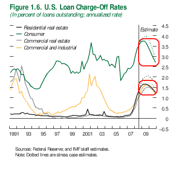
Chart 1 – U.S. Loan Charge-Off Rates
The first chart comes from the 2008 report. Since this chart was produced, default rates have actually increased across all categories. Commercial real estate is only starting to implode while consumer debt is being charged off at record rates. Capital One recently announced charge off rates in the 9 percent range. So the estimate on this chart is already off. Commercial and industrial real estate is being hit hard because the recession has now moved from the computer terminal economy to the real economy in a serious way. Consumers have cut back drastically and businesses are feeling this new austerity.
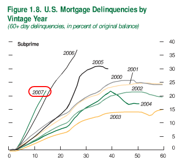
Chart 2 – Subprime Loans
As we all know, subprime loans are extremely problematic. As the chart above highlights subprime loans were defaulting in the 30 to 40 percent range in 2007. Of course in 2008 this only expanded but most of these have already worked their way through the system. These loans had a tiny buffer and with that, many were foreclosed on. Yet the major future mortgage problems will be shown in our next two charts.
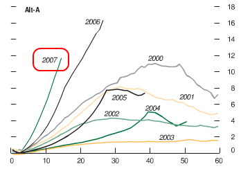
Chart 3 – Alt-A Loans
Alt-A loans were supposed to be better quality loans. Well just compare chart 2 and 3 and you’ll recognize a very similar pattern. These are not quality loans. What happened here is someone that managed to keep their credit score clean was able to over extend and jump into a loan that they clearly could not have managed. Of course lenders were more than happy to oblige as well. Yet these loans are even more toxic than subprime loans because they typically carry a much bigger balance. That is, with these things exploding they carry a bigger punch. In 2008 the rate increased even further and we are in the middle of this. Expect to see a trajectory similar to the subprime chart.
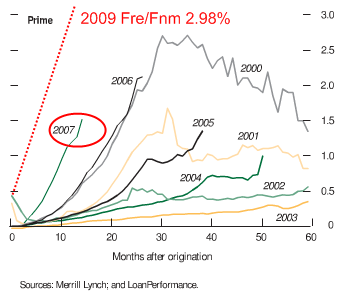
Chart 4 – Prime Mortgages
This is the more troubling chart. A recent report shows that of prime mortgages, 2.98% are now 60+ days late (of mortgages backed by Freddie Mac and Fannie Mae). I’ve added the 2009 line because that is how wide this change is. These loans are supposedly the best of the best. Since this is such a gigantic pool, a slight 1 percent jump is significant. For example, 2.98% comes out to 743,686 loans. That is an enormous amount. And given the current recession, the longest since the Great Depression and the employment situation, many of those loans will not be brought current. That is, the pipeline is filling up with more foreclosures. With subprime and Alt-A you simply saw bad loans go bad. But here, we are seeing better quality loans go bad for more historical reasons (i.e., job losses and poor economy).
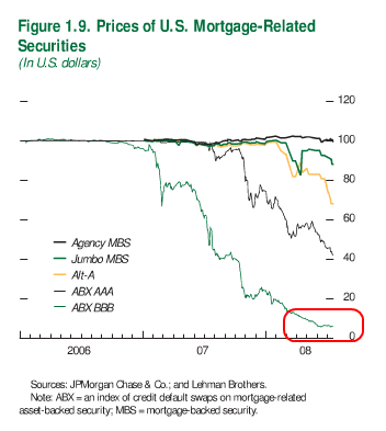
Chart 5 – MBS Prices
The demand for mortgage backed securities has virtually disappeared. As you can see from the above chart, prices have collapsed. What occurred here? Mortgages were bundled and sold off as bonds and portrayed to investors as safe bets. Well all that is now out the window. Most of the fuel was created by the subprime and Alt-A markets that Wall Street was so hungry for. But now, agency debt is pretty much the only game in town and it is much more restrictive. And what the chart above produced in 2008 does not show, is now agency debt is falling because as we just discussed, many of those prime loans are now going bad.
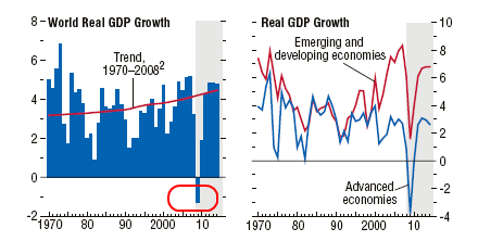
Chart 6 – World GDP
The above chart is from the April 2009 report. Yet this is where things get a bit more difficult to decipher. As you can see from the above chart, you see 2009 as a declining year but all of a sudden things turn up in 2010. If we look at the chart next to it, we see that emerging markets have yet to fall in line with advanced economies. Most of the emerging economy growth has been dependent on advanced economy-inflows of money or by growth in imports (which have collapsed). So the only way we get back to solid growth next year is if:
a. More money flows into emerging economies
b. Advanced economies stabilize and start seeing increased demand
Given the above charts, that is highly unlikely. At least the IMF is more realistic about the second half recovery.
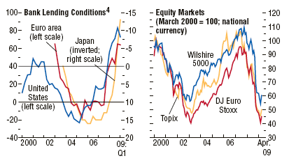
Chart 7 – Bank Lending and Global Stock Markets
Just look at the Wilshire 5000, Topix, and DJ Euro Stoxx charts. They are off by 40 to 50 percent and that includes the recent run up in prices. You can also see above that bank lending conditions are still tight. Well of course they are. Economies are contracting from a global credit bubble 30 years in the making. To think that all of a sudden in 6 months we can undo decades of excess is simply too optimistic. We will have a sluggish recovery at best and a prolonged slump like Japan at worst.
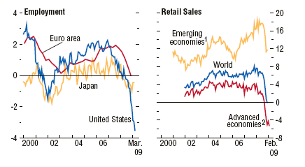
Chart 8 – Employment and Retail Sales
Even the optimist agree that we will see continued unemployment growth into 2010. Yet most people depend on their wages as a guide to how they interact with the economy. Those that are unemployed are not buying cars or homes because they have no income stream. You can make mortgage rates go to 0 percent but what use is it if someone has no income? As you can see from the above chart, the employment situation is quickly contracting. I would make a note that with Japan, they have a disproportionately high number of part-time workers which makes their overall employment situation appear better. We are moving that way. We are now upwards of 9 million part-time workers in our economy. Add in the 13 million unemployed and you get a better sense of what is occurring in our economy. And the next chart with retail sales is showing the contraction being experienced by consumers. It would logically follow that rising unemployment across the globe would cut into the wallets of millions of families.
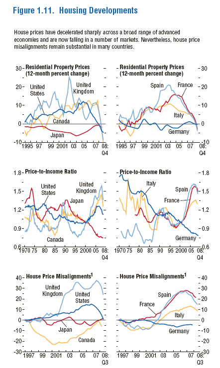
Chart 9 – Global Housing
Many Americans would have a hard time believing that any other country could have had a bigger housing bubble. But many have. In fact, these bubbles occurred in so-called “advanced economies” and they are even a year or two behind us. Meaning, they have yet to experience the dramatic contraction we have faced. So that in itself assures us that globally, we will be seeing more bad debt being written off. Take a look at the above charts.  As you can see, the United Kingdom and Canada both have bubbles that are still larger in terms of price-to-income ratios. There is no reason to believe they won’t correct. This process is already occurring. So expect more pain for global banks.
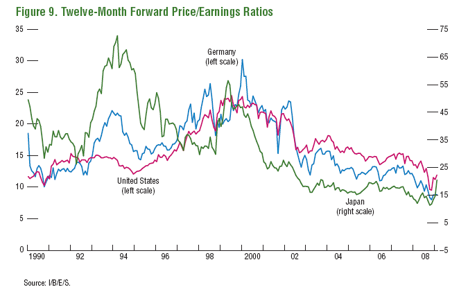
Chart 10 – Price to Earnings
Finally, global equity markets are still over priced. Why? They are factoring in a second half recovery. That won’t be happening. In fact, during the Great Depression P/E ratios fell to 5 or so yet we are still solidly over 10. Are we to expect businesses to go back to full capacity anytime soon? On the contrary, businesses are closing shop and cutting back their employment base. This will take time to work through the economy.
What these 10 charts show us is the global economy will have a rough 2009. We may be fortunate and see some recovery in 2010 but there really is no reason to believe this. Employment, although a lagging indicator, will need to show signs of growth. And currently the U.S. Treasury and Federal Reserve are desperately trying to destroy the dollar. This has the potential of massively back firing. Either way, we are going to soon find out if all the bailouts and trillions funneled in the system will have an impact on the bottom line of many families. So far, it hasn’t.
If you enjoyed this post click here to subscribe to a complete feed and stay up to date with today’s challenging market!5 Comments on this post
Trackbacks
-
Tony said:
THANK YOU
GREAT STUFF. DO YOU HAVE ANY PROJECTIONS AS TO WHEN FEDERAL MONEY WILL ACTUALLY BE DISTRIBUTED AND IN WHICH BUSINESS SECTORS? ALSO, ANY PROJECTIONS AS TO JOB CREATION IN SPECIFIC SECTORS AND WHEN? ASSUMING THE FEDERAL GOVT IS DETERMINED TO DESTROY THE DOLLAR, WHERE DOES ONE INVEST DOLLARS NOW TO PREVENT THE DETERIORATION OF ONE’S PORTFOLIO???
ALL FEEDBACK IS MUCH APPRECIATED.
TONY
April 23rd, 2009 at 10:51 am -
high_limit_credit_card said:
Looks like we’re headed for something nasty. I’d say the focus in our economy right now should be on increasing domestic production and having an innovative, productive economy. That’s the only way we stay relevant and survive the current crisis with our current status at the top of the global markets intact. From consumerism to production. Take a model from China or India.
April 24th, 2009 at 10:21 am -
Larry said:
Just remember to take into account that the three consecutive charts re mortgages have identical horizontal scales but vertical scales that vary from 40 to 18 to 3 percent. The variation of the vertical scale visually skews the increase in delinquency in a major way, making it appear worse than it is.
April 25th, 2009 at 4:07 pm -
Its Obvious said:
It should be obvious where to invest your money. Gold and silver has been money for 5000 years – through countless civilizations and has never lost its value, because no one can sit in a room and print it up.
April 27th, 2009 at 4:37 am -
Ed said:
We should follow the steps of the BRIC nations. They are Brazil, Russia, India and China. They prefer to increase domestic production and consumption and stay out of other countries affairs. The US should learn from them. The wars have already cost taxpayers over a trillion dollars so far. Time to keep the money at home. Charity begins at home.
December 2nd, 2009 at 7:39 am
 If you enjoyed this post click here to subscribe to a complete feed and stay up to date with today’s challenging market!