The October 2008 Job Report: Digging Deeper into the Data. True Unemployment Rate at 11.8%.
- 1 Comment
Trying to explain the unemployment rate is a challenge since there are many nuances to look out for. For example, today the unemployment rate came out at 6.5%, the highest since March of 1994. That would be troubling in itself. What was also released in the report is a horrible number of 240,000 jobs being lost in October. Probably more surprising is the September employment number was revised to show a 284,000 job loss. What does this amount to? 1.179 million jobs have been lost since the start of 2008. It has been a very challenging year on the jobs front.
In this article we’ll try to breakdown some of the details in the job report since it may be confusing to many. I will also argue that the true unemployment rate is more likely to be near 11.8%.
First let, us take a look at the exponential jump in the unemployment rate:
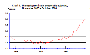
From this chart it is pretty clear how quickly the employment situation has deteriorated. Much of this has to do with housing and the credit crisis and areas like California housing that are simply having the worst housing decline in recent memory.  The above chart doesn’t show the entire picture however. Let us expand the chart out to 1990:
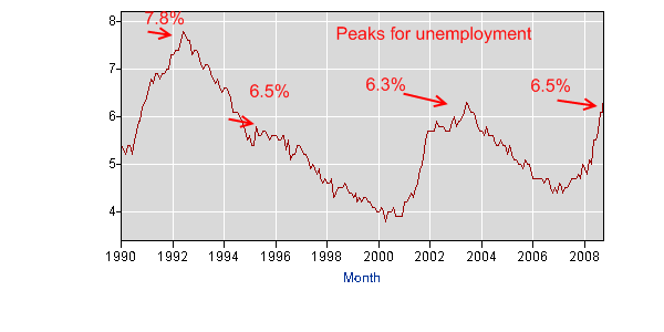
The above chart does a better job showing the current employment situation in perspective. We have the early 90s recession and also the early recession this decade. The troubling thing about unemployment is that the rate doesn’t peak for a few years after a recession has started. Let us take a look at this with data from the Federal Reserve showing recessions:
Recession
Early 1980s recession:Â July 1981 – November 1982
Recession of the early 1990s:Â 1990-91
Early 2000s recession:Â 2001-2003
Peak Unemployment
Early 1980s recession:Â Peak hit on February 1983 at 10.4%
Recession of the early 1990s:Â Peak hit on June 1993 at 7.8%
Early 2000s recession:Â Peak hit on June 2003 at 6.3%
Using the above as a guideline, we get a pretty reliable range of approximately 2 years from when the recession begins, to where peak unemployment is hit. The third quarter GDP was our first official contraction although it was slight. So we can mark the start of the “official” recession on July of 2008. Meaning, we can expect peak unemployment to hit sometime in the summer of 2010 if the last three recessional patterns hold up.
Again, this recession by all estimates will be more painful and more prolonged so it is hard to say if the above will hold true. If we go back to the Great Depression, that contraction lasted a painful 10 years from 1929 to 1939. If you think that was long you should consider the Long Depression of 1873 – 1896. A 23 year contraction.
Let us now look at a chart in the employment report which I believe reflects a better view of the real unemployment rate. A-12 shows various ways of measuring employment. I believe that U-6 in the table is a much better reflection of the country’s employment scene:
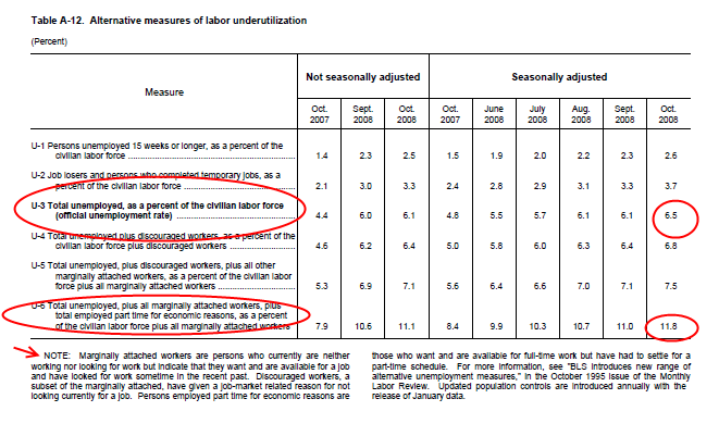
Now why is this a better measure. It includes “marginally attached workers” who are people that are looking (or not looking) for work but want to work. You can consider this batch the discouraged worker subset. In addition, the number of part time workers has been growing. So looking at the difference between U-3 which is reported by the median and U-6 we get a large difference. One is 6.5% and the other pushes the number up to 11.8%. That is why it feels much worse than a 6.5% environment. I think most people would agree that someone who wants work but has given up searching should be considered unemployed. Then in this subset, you have those looking for work but not stating why but this may be someone working a few hours at a job but in reality is looking for full-time employment. They too should be considered. The 11.8% number is stunning and incredibly high. Remember at the height of the Great Depression the unemployment rate hit 25%:
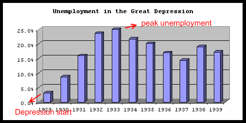
The above pattern also holds out for the Great Depression. The actual business contraction cycle peaked in August of 1929 and didn’t hit trough until March of 1933. The market hit a peak in September of 1929 but we are referring more to the business cycle. As you can see from the chart, the peak was hit in 1933 but in reality peak unemployment was essentially reached in 1932 which already was over 20%. So using the above model of 2 to 3 years from the start of the cycle, it also held true back then as well. Depending on the severity, the longevity of the contraction can be drawn out. As you can see from the other charts above, the 2001-03 recession quickly recovered.
As of October of 2008, 10,080,000 people are unemployed from a total 155,038,000 workforce. I wanted to dig deeper into the Great Depression data but of course it is hard to find data during this time. I did however find a 1930 Census report and here are the raw numbers:
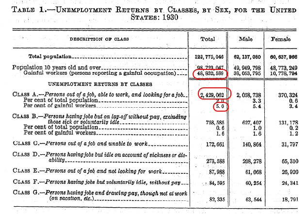
Very quickly we can say that the data in this chart was most likely produced in 1929 which would have had the favorable unemployment rate of roughly 5%. But let us take that actual workforce and we can then get a figure of the actual number of unemployed during that time:
1930 Workforce:Â Â Â Â Â Â Â Â 48,832,859
1930 unemployed:Â Â Â Â Â 2,429,062
5% rate
If we use the 25% peak reached in 1933, we can say that 12,208,214 people were out of work during the Great Depression. That should put that 10,080,000 number in perspective. Keep in mind our employment base is now 3 times as big but just thinking that we have nearly as many people unemployed since the Great Depression is a sobering fact.
So when you dig into the employment report, you will find some fascinating data that goes beyond the actual mainstream number reported. Given the history of past recessions, we can expect the employment situation to deteriorate at least until the summer of 2010.
If you enjoyed this post click here to subscribe to a complete feed and stay up to date with today’s challenging market! If you enjoyed this post click here to subscribe to a complete feed and stay up to date with today’s challenging market!
1 Comments on this post
Trackbacks
-
Suziclue said:
Great Post! and very detailed information that we all need to see and understand. I think with our newly elected president we can begin the change and maybe in 4 to 5 years, things will start to improve. It’s just hard for everyone to see their home prices fall so much. I know I have friends in Los Angeles who are forced to give up their homes as the value is less than the equity they owe. It’s a mess!
Keep up the good work in keeping us informed!Source: http://www.homepricetrend.com
November 8th, 2008 at 2:32 am