The Scariest Graph Ever: Home Mortgage Debt and Consumer Credit.
- 8 Comment
As the housing market continues its crash and burn path, it is sometimes difficult to put into words the incredible amount of mortgage debt floating around in the market. Since the 90s, mortgage debt has exploded and has followed a celestial trajectory to the moon. Mortgage debt has grown since 1997 for over a decade nearly unabated. Take a look at this chart below:
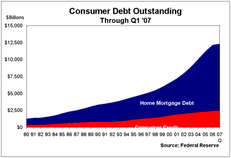
Mortgage debt is an astounding $13 trillion. Given that all residential housing in the US is valued in the ballpark of $20 trillion, any moderate declines will put a damper on housing prices while maintaining the enormous amount of debt. The problem that occurs with this is that we have one moving target (housing prices) and one stationary target (debt). If you wonder why so many people are being foreclosed upon, the above graph is one major reason.
During the last decade, housing has been in an amazing growth pattern. The reason we didn’t see much housing problems during this time is that the rising sea of housing prices masked the problem loans. That is, if someone got into problems or over paid by a few thousand, it was easy to simply put the home on the market and leave relatively unscathed. So what occurred in the last year or so that has set the market falling off a cliff? Well for one, many toxic loans had teaser periods that were set to go off in 2007 – 2010. If you think we are out of the woods, just look at this chart:
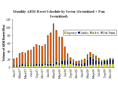
We haven’t even entered the peak turning point in the housing market. The biggest month in terms of resets will be March of 2008. We are quickly approaching the zero sum moment and now we are hearing open talks about bailing out lenders for their lax lending. It will be a hard challenge for Americans to adjust to a culture where debt is tighter and fewer and fewer people will want to consume. Yet this is where we stand. Banks are cautious about giving money out since they are now in need of shoring up liquidity for further rate resets. As you can see from the chart above, we are going to have large months of resets well into October of this year.
The chart only shows one side of the story. We haven’t even started to address the oncoming onslaught of resets with PayOption ARM mortgages. A PayOption ARM gives you three pay options:
1. Full payment (principal, interest)
2. Interest only – self explanatory
3. Pay Option – negative amortization where your balance increases
I was astounded to see reports that nearly 70 to 80 percent of those that take out Pay Option mortgages elect to go with option 3 above. Many of these loans are set to adjust in 2010, right when we are finishing cleaning up the subprime mess. Now there has been much said about programs to allow owners in these toxic loans to refinance out. Well the fact that many are paying the actual bare minimum tells us that people are simply scratching by so a conventional mortgage isn’t going to help them out because it will force the balance up and push them into option 1. Now if they weren’t paying option 1 now why is a smaller lower rate going to help them out? The above graphs are scary indeed given what we are seeing in the credit markets.
If you enjoyed this post click here to subscribe to a complete feed and stay up to date with today’s challenging market! If you enjoyed this post click here to subscribe to a complete feed and stay up to date with today’s challenging market!
8 Comments on this post
Trackbacks
-
b-ryan said:
Let the lenders fail, seize their assets (starting with officer perks ‘n’ pay) and shut them down.
This will certainly keep the surviving lenders from investing in stupid get-rich-quick schemes such as sub-prime loans.
April 10th, 2008 at 2:53 pm -
House Refinancing said:
Great post, really enjoyed it. I will have to bookmark your site for later.
April 29th, 2008 at 9:18 am -
DebtLoan said:
It is really true that we didn’t see much housing problems during this time is becaise the rising sea of housing prices masked the problem loans.
May 4th, 2008 at 3:14 am -
Finance Talks said:
Great post! Very informative and well-stated. True, the graphs as shown above are scary.
-Joanne
May 6th, 2008 at 1:11 am -
Debt Consolidation said:
Great article. It certainly is a big wake up call and a hugre reality check. Thanks for providing all the useful information!
May 10th, 2008 at 6:03 pm
[…] The Scariest Graph Ever: Home Mortgage Debt and Consumer Credit As the housing market continues its crash and burn path, it is sometimes difficult Fiend Superbear; Money Files; housing. Dr. Housing Bubble; Mortgage Implode; NYC Housing Bubble; Patrick.net […]
[…] and Consumer Credit. As the housing market continues its crash and burn path, it is sometimes …http://www.mybudget360.com/the-scariest-graph-ever-home-mortgage-debt-and-consumer-credit/Everhome mortgageeverhome mortgage: a few tips regarding No Cost mortgage Refinance … The monthly […]
[…] The Scariest Graph Ever: Home Mortgage Debt and Consumer Credit Mortgage Implode; NYC Housing Bubble; Patrick.net [ ] everhome mortgage Says: May 16th, 2008 at 3:35 am [ ] and Consumer Credit. As the housing market continues its crash […]