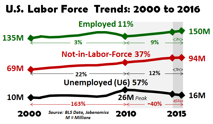
Those not in the labor force grows by 25,000,000 people from 2000 to 2016: During this same period those employed grew by 15 million and those unemployed grew by 6 million.
- 0 Comments
The unemployment rate looks dramatically better than it really is because of some funny accounting. Our labor force looks dramatically different from what it did in 2000. A large part of the low unemployment rate is coming from those not in the labor force. I’m fascinated with this aspect of the employment situation because it is rarely discussed and is largely an elephant in the room. Most pundits like to assume that most of the growth is simply coming from an older population. Even if that were the case, many older Americans need to work until they die since they have paltry retirement accounts. The figures have grown so disproportionately large that we have a shadow class of the population that is now voting for non-establishment candidates. The mainstream press tends to report on large sealed off metro areas that neglect most of the country. Let us look at the numbers here.
The US labor force dissected
We can break down the labor force into 3 distinct categories:
-1. Those that are employed
-2. Those not in the labor force
-3. Those that are unemployed
This is a good summation of our labor force. Looking at one year of data doesn’t really highlight a trend but just look at what has happened since 2000:
This is where things get interesting:
-1. Employed – this grew by 15 million since 2000 (an 11% increase)
-2. Not in the labor force – this grew by 25 million (a 37% increase)
-3. Unemployed – this grew by 6 million (a 57% increase)
It is interesting to see that we’ve grown our employed base by 15 million yet our “not in the labor force†base is up by 25 million – 10 million more than those being employed. Then you throw in the growth of 6 million that are unemployed and you start getting a better sense as to why Americas are frustrated even though the headline unemployment rate looks low. It looks low because you are yanking out 25 million people from your calculations.
Certainly a large number of people are retiring. But this is dangerous math as well. This assumes that those that retire are riding into the sunset with large nest eggs. Sadly, that is not the case. Almost half of retirees fully depend on Social Security as their primary source of income. Without that income, they’d be out on the streets.
We also have a large army of young workers now employed in the low wage segment of our economy. As many of you know, those receiving Social Security for example depend on having a robust tax paying employment base. Growing the not in the labor force category by 25 million does not help that cause. Then again, the unemployment rate looks great!
If you enjoyed this post click here to subscribe to a complete feed and stay up to date with today’s challenging market! If you enjoyed this post click here to subscribe to a complete feed and stay up to date with today’s challenging market! Â