Cascading risk and economic headwinds – 5 charts examining the coming financial challenges for the American economy. Inflation is much higher than you would expect but Federal Reserve orchestrating greatest banking bailout in history.
- 3 Comment
The American economy appears on the rugged surface to be stabilizing but only if you fail to look under the hood. Today, we have a record 46,000,000 Americans on food stamps. Many of these people were once moving into the middle class but were launched off the economic treadmill. The banking syndicate that caused the greatest financial crisis since the Great Depression has largely blocked any substantive financial reform. So all the risks that led to the crash are not only pervasive in the system but are now much larger since governments are largely backing these giant irresponsible bets. The data for the typical American shows a gloomy economy largely disconnected from the news pushed out by Wall Street investment banks. Today we examine five charts and the implication they contain for the future of the American economy.
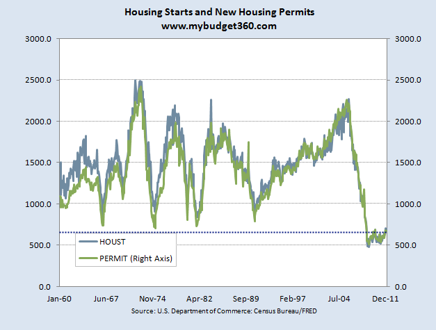
Chart 1 – Housing starts and permits
We first start with the collapse in the housing market. This is a giant part of the economy because residential housing has always been a key player in any economic recovery. Housing starts have collapsed to levels last seen in the Great Depression. The chart above is instrumental to understanding the massive lag that housing will have on the economy.
For example, at one point housing starts were running over 2,000,000+ homes per year. This incredible pace is now down to 500,000 and is slightly picking up. This is a key indicator to look at since builders are on the ground and have a better sense of demand. With many baby boomers downsizing and more foreclosures coming online, there is little reason to assume a major burst in residential building activity is in the cards for the short-term. As a matter of fact the odds are this may move lower in the next couple of years.
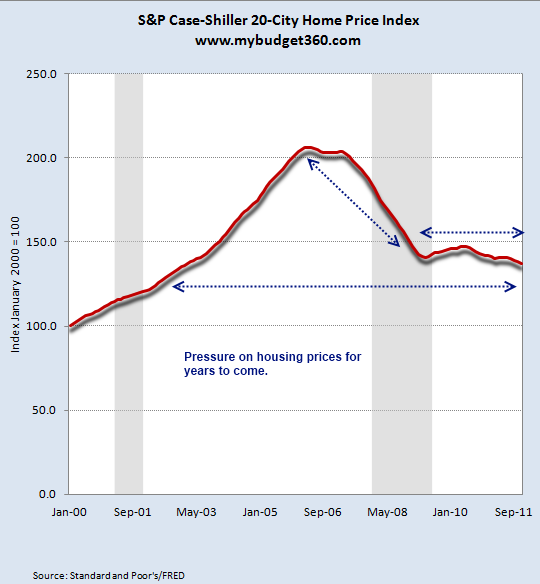
Chart 2 – Home prices continue to move lower
More on the housing front, most Americans carry most of their net worth in real estate equity. Well when home prices are down by over 33 percent from the peak you begin to understand that the vast majority of American households have seen their largest asset class crash. Over $7 trillion dollars in perceived housing wealth is now gone. The above chart is important because it highlights the reality that those in the home buying market are there but are willing to pay only a lower price. Do you think that the average per capita income of $25,000 a year has something to do with this as well?
When you look at charts like the above you realize that we are witnessing a lost decade in our housing market. The odds of having two lost decades are very strong. Why? Typically housing values went up with household incomes. Where are we seeing wages increase? To the contrary global economic pressures are pushing wages even lower. Without sustained household income growth there is little reason to believe real estate values will move up. This also goes with the first chart since builders want to maximize their return and to compete with current foreclosures at much lower prices is still not worth their time. Otherwise, we would see home builder permit activity blast off.
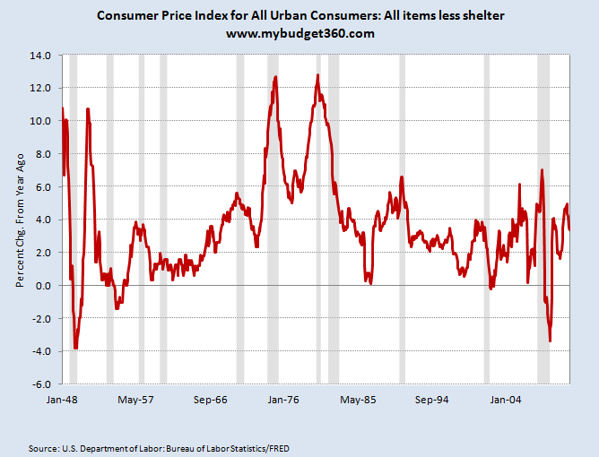
Chart 3 – Inflation is picking up outside of housing
Inflation excluding housing has picked up some significant speed. Since the lows of the recession inflation is running at roughly 4 percent excluding housing. Since household wages are stagnant this mean Americans are becoming poorer simply by the momentum of inflation. Each dollar you get is purchasing much less. This must come as no surprise.  Just go to your local grocery and see if prices are falling. Try taking a look at the tuition for colleges and see if prices are lower. Things are getting more expensive because actions taken by the Fed to aid their banking colleagues are simply devaluing the dollar. This is the hidden cost of the Fed and banking bailouts that rarely hit the media. They just assume inflation is a natural part of any economic system.
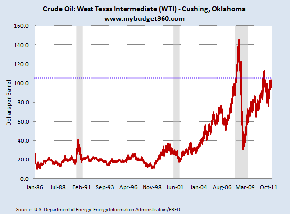
Think cheap energy is still cheap? Oil is sometimes viewed as a proxy for US dollar health and currently we are seeing a surge in this part of the economy.
Chart 4 – Oil prices surge
Cheap energy is still a large mover in our economy and the fact that many automakers had good years played on the momentum of cheap energy that hit once the bubble burst in 2009. Look at the chart above. The cost to fill up your car is now over $4 a gallon in many places but this is only the direct link. This rise in fuel costs will be seen in many items like:
-Passed on costs for food transport
-Airline travel
-Products that use oil as an ingredient
This is a massive part of our economy. Only 30 years ago the US imported roughly 28 percent of the oil we use. Today it is approximately 60 percent. Think this won’t have an impact on the economy especially when you combine it with the weak housing market and pressure on lower wages?
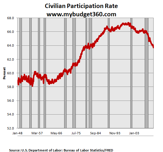
Chart 5 – The working America
The civilian-participation ratio continues to hike lower. You have an older population with many baby boomers retiring impacting this figure. You also have many that have fallen into the dark shadows like many of those on food assistance.  You have many going back to school or staying in school buy many are being lured in by paper mill jungles of for-profit colleges. The fact that this figure continues to move lower on the surface improves the unemployment rate. After all, if you don’t count yourself as looking for work then how can you be unemployed?
Here is some interesting math to consider:
“(OfTwoMinds) The official unemployment rate was 10% in October 2009, when about 140 million people were found to have some sort of job, and now that the same number of people have been found to have some sort of job (140 million), the unemployment rate is now only 8.3%, even though the nation has added roughly 6 million residents to the workforce.
Huh? How can 140 million jobs generate an unemployment rate of 10% in 2009 and 8.3% in 2012 while the workforce and population have grown by 6 million? If anything, the unemployment rate should be higher, since the number of people with jobs has held steady while the number of people without jobs has expanded.â€
As usual with media reporting and projections from the financial sector it is wise for you to use your own judgment. If you look under the hood of the economy, things remain precariously weak for most Americans while financial sector profits soar. Not bad when you have the Fed funneling trillions of dollars in bailouts for massively bad bets that go unchecked.
If you enjoyed this post click here to subscribe to a complete feed and stay up to date with today’s challenging market!
3 Comments on this post
Trackbacks
-
clarence swinney said:
THANKS AS USUAL YOU ARE GREEEEEAT
February 20th, 2012 at 7:05 am -
expatriot said:
civilian participation report most important chart. followed by the oil chart. our economies in the tank and for the millions of unemployed filling up their gas tank just won’t be an option. Maybe six dollar a gallon gas by summer. Today, oil prices are the highest they’ve ever been in february. Food prices are going up and the truth is the 48 million on food stamps don’t get a whole lot on their cards. Prepare accordingly.
February 21st, 2012 at 11:58 pm -
Randy Pickard said:
Here is another reason to be suspicious of the reported decline in the unemployment rate. According to research from JPMorgan Chase about 5.3 percent of the population between the ages of 25 and 64 is currently collecting federal disability payments, a jump from 4.5 percent since the economy slid into a recession. This factor provides part of the answer for why the participation rate is falling.
February 22nd, 2012 at 8:55 am
 If you enjoyed this post click here to subscribe to a complete feed and stay up to date with today’s challenging market!