Economic and Investing Forecast for 2009: 10 Charts Showing no Economic Rebound in 2009.
- 0 Comments
Today the ADP National Employment Report stated that private sector jobs fell by a much larger than expected 693,000 in December. This report stunned on the downside and is a prelude to the Bureau of Labor and Statistics report which comes out on Friday. The market also suffered its worst one day since early December. We’ve been on a relatively stable rally from the November 15 bottom yet 2009 will once again show us that there is much more market volatility floating in the economy. Much of the volatility will come from the stimulus plan and also, the liquidity floating in the system.
In regards to the stimulus, I imagine that it will be pass rather quickly in the first quarter. Aside from the tax cuts which can be put into effect quickly, the other programs will take time to make their way into the economy. That is why I am unsure why many people looking at this year think that we will be on an upswing come the third quarter. It is a random placeholder and it is also a marker of the worst recession length since the Great Depression. With the U.S. Treasury and Federal Reserve determined to destroy the U.S. dollar, all bets are off the table in terms of what is going to happen. 6 months ago we had no TARP, no Fannie Mae and Freddie Mac nationalization, no auto bailout, and no massive exchanges from the Fed (trillions) for unknown securities. 6 months from now things will be very different.
In today’s article I want to go through 10 up to date charts showing why this recession will be the worst since World War II. Things have gotten worse since our last analysis and the ADP report merely reflects that reality. You may think that 3 million jobs added as the stimulus plan proposes is a lot but all we would need is four months like December and we are basically running at a neutral pace.
I found a clip on the Internet Archive from 1935 talking about “Financing the American Family” and think many of you will enjoy this 10 minute clip:
I love how the banker in the early part of the video will ask the borrower:
“how much of a loan do your require Mr. Brown?”
After the question is asked, the borrower is denied. The borrower later will ask the banker:
“But I don’t quite understand you?”
Glad to see that banking was convoluted back in the 1930s as well. The borrower eventually gets a loan after a stringent verification which included a visit to the household from another lending organization! Can you imagine Visa or American Express coming to your home before giving you a $10,000 limit credit card? If that were the case, the United States probably wouldn’t be in $49 trillion of debt.
These 10 charts are important because they cover vital industries of the U.S. economy. Automobiles, housing, consumer sentiment, and interest rates are only a few of the engines moving this economy. All seem to be seizing up. Until we see significant movement upward in these charts, there is little reason to believe 2009 will be the year of the turn around.
Chart 1 – Retail Sales
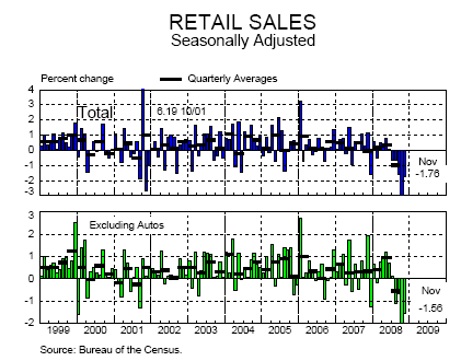
The holiday shopping season is over and it disappointed. Many retailers were hoping to have an unusually strong shopping season to make up for a weak 2008 but that was not the case. Foot traffic was brisk but shoppers were holding on tight to their money and buying heavily discounted goods in contrast to more big-ticket items. Smaller cheaper gifts trumped more expensive items. You can see this by looking at two companies and their 2008 year performance:
Wal-Mart (2008 increase):Â Â Â +16 percent
Best Buy (2008 decrease):Â Â Â Â -46 percent
Until we see major trend changes in retail sales, there is little reason to think the economy is improving.
Chart 2 – Motor Vehicle Sales
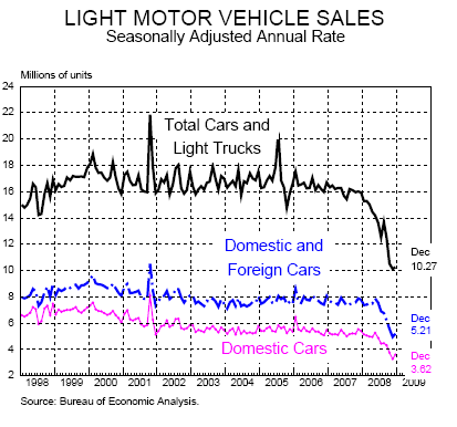
Automotive sales for December were absolutely horrific. So bad in fact that Toyota will be idling some of their plants. Keep in mind some of the U.S. automakers are already idling and also, going to the government for bailouts. Look at the above chart and you’ll see how pronounced the actual drop is.
Both domestic and foreign auto sales are faltering. You can think of the fall in sales almost as a reverse pyramid.  That is, first the biggest purchase item homes slamming on the breaks. Next biggest purchase, autos are now falling. Next big purchase? Probably furniture or electronics which is now stalling. It is a cascading systematic freezing up of the system.
Unfortunately there really isn’t any problem in auto sales per se. If you look at the chart from a different perspective, what we did is actually buy up too many cars in this decade and we now have a glut of autos in the system. Don’t expect this to boom this year either.
Chart 3 – Housing Starts
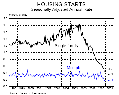
Similar to what is happening with auto sales and plants being idled, builders are simply not building any new homes.  Why would they? There is a flood of homes on the market and keep in mind foreclosures will remain high in 2009 so that is a guarantee of additional inventory hitting the market. Recent reports show that nationwide 50 percent of home sales are distressed properties. A builder would be insane to go heads up with some of these homes and the discounts they are seeing. Bottom line? Those that can build are fighting to stay alive.
This housing bubble is 3 decades in the making. We’ve bought and built enough housing for many years. 2009 will not see a massive increase here.
Chart 4 – Home Sales
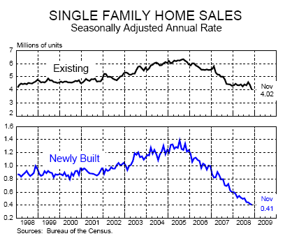
It shouldn’t be a surprise from the previous chart to see home sales still searching desperately for a bottom. The initial stages of the bust in home sales was due to the disappearance of creative financing. Next, we had the freeze in the credit markets. Now, who is looking to buy a home when their employment is uncertain? Many Americans feel that way. In difficult times families pull back and become more conservative in what they buy, including homes.
The only big sales we’ll see here are in distressed properties and this trend will continue throughout 2009.
Chart 5 – Consumer Surveys
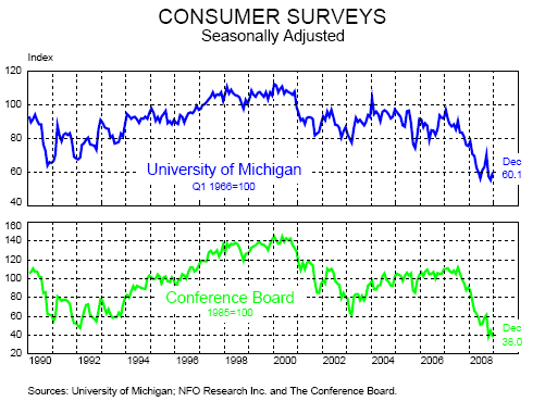
Consumers are not feeling good. This trend is still going lower and lower. If we actually look at a longer view, we are at multi-decade lows:
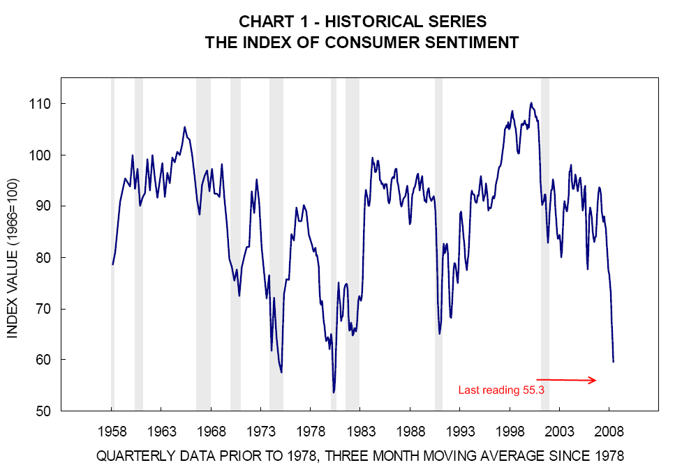
It is hard for consumers to spend when they are not feeling good regarding the current economic situation. A consumer that does now feel happy today will not spend tomorrow. That is why looking at these reports tells us that 2009 will be another tough year.
Chart 6 – Real GDP
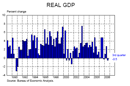
Ultimately all this translates to a contraction in GDP. The fourth quarter data is yet to be released but we can safely assume that it contracted. There is very little to expect with such large job losses and contraction in consumer spending, that GDP will perk up anytime this year. If we go past June with falling GDP this will be the worst recession since the Great Depression. All we need is 16 months. We’re already in month 13 since this recession “officially” started in December of 2007. How can we be only a few months from saying this is the worst recession since the Great Depression yet unemployment is at a moderately high 6.7%? Because our economic measuring sticks are broken; we are walking into Chernobyl with broken Geiger counters. Unemployment is understated by not looking at those who have given up looking for work and those employed part-time but want full-time employment. Also, the Fed missed asset inflation for this entire decade and now they are being blindsided by deflation.
Chart 7 – Unemployment Rate
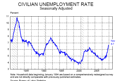
If the ADP report is any early indicator, the December job losses are going to be horrible when they are reported on Friday. Normally the ADP report comes in under the BLS numbers so we may actually see a 700,000+ job loss month. That is simply breathtaking. We are now getting close to 1 million job losses in one month. We haven’t seen such a deterioration in our overall economy happen so fast.
Clearly it is a lot about employment. Someone that doesn’t have a job won’t buy a car or a home. Someone that isn’t working is not buying in retail stores. So this factor must be addressed and addressed quickly. In fact, looking at bailing out the banking system first since the credit crunch in August of 2007 was so short-sighted. We are only now addressing the jobs front nearly 18 months later.
Chart 8 – Non-farm Payroll Employment
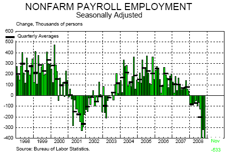
It is amazing that we lost jobs every month in 2008. Not one net job added the entire year. This is a chart we will need to keep an eye on. In fact, with the new stimulus package and job growth in the government sector, it will be important to separate job growth in government jobs and those in the private sector. This will give us a better indicator how the overall economy is doing without the government’s help. In terms of analysis, it will give us a clearer picture. Why? It is one thing to say we added 100,000 jobs in X month but if you see the private sector shed 400,000 jobs and the government added 500,000, is this really a big gain?
Chart 9 – Household Debt Burden
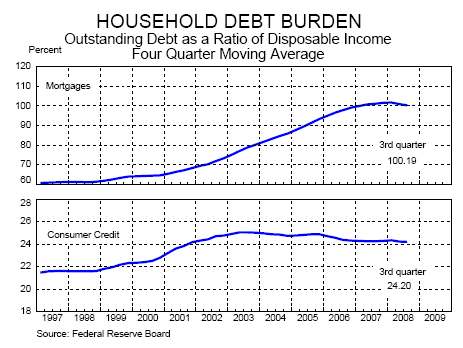
Even in light of the above and all the $50 trillion in wealth destruction globally, the American household is still swimming in a mountain of debt. There is nothing more menacing than deflation when you have debt. To a large degree, that is why Ben Bernanke and Henry Paulson want to destroy the U.S. dollar to inflate us out of our incredible debt. It is amazing how few politicians admit to what they are doing.
Can you imagine if Bernanke or Paulson went up to D.C. and stated clearly, “our policy will dilute and depreciate the U.S. dollar.” How do you think the public will respond? If we continue down the path of deflation, this debt is going to be crippling and banks still have billions in questionable assets on their books. That is why the 8,300+ institutions insured by the FDIC are at peril in the next few years.
Chart 10 – Short-term Interest Rates
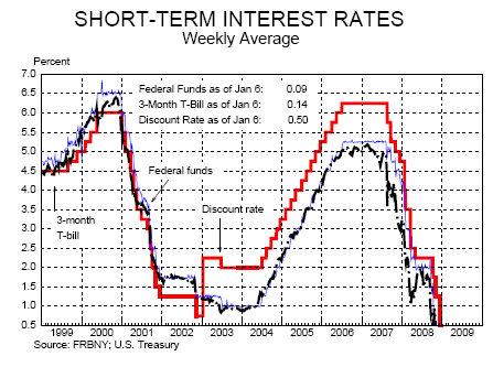
Welcome to the zero interest rate policy world of 2009. This is a very difficult place for monetary policy to find itself as I have discussed. The Fed has lost its most powerful tool which under Greenspan, use to be the ability to jawbone and talk markets up and down. What is the Fed going to do now? Threaten to take rates from 0.25 to 0.10? The market for all purposes is already at zero.
Yet looking at the American consumer debt burden, even a zero percent rate is too high since it isn’t a problem of getting credit but the fact that there is already too much debt on their balance sheet. The Fed wrongly thought they could lower rates aggressively and get people to borrow again. Reinvent the wheel. Yet the debt on the books is already too high. At this point, the Fed and U.S. Treasury are giving tax payer money away to banks and lending institutions and they are gladly taking it. Yet the ultimate consumer is not and how can they? They are maxed out.
If you really look at these 10 charts, how can you arrive at any other conclusion except one that tells you 2009 will be an equally tough year like 2008?
If you enjoyed this post click here to subscribe to a complete feed and stay up to date with today’s challenging market! If you enjoyed this post click here to subscribe to a complete feed and stay up to date with today’s challenging market!